Monday, December 21, 2009

Thoughts on Generating New Ideas

My thoughts on generating good ideas for illustration taken from a recent interview with some follow-up question and answers provided as well.

Some people refer to a problem among creative people as 'writer's block' to describe a condition where producing an idea on que is daunting
and can become quiet frustrating if the 'block' continues over a prolonged period of time, especially if a deadline of some sort is involved.
I've encountered this scenario more than a few times myself. And like others who have faced this issue, I sought answers.
Along the way I learned many different ways to deal with this and most of the time I can get the ideas with no problem now if I use some of the tools I've learned along the way.

Designer Paul Rand said, "It's not important to be original, it's important to produce consistently good quality work." So don't always be trying to re-invent the wheel for everything you do, focus on the quality of the work.

In the 1940s there was an excellent comic book artist named Mort Meskin who had the equivalent of 'drawing stage fright' each day he came to work. He would sit at his drawing table and according to Will Eisner, creator of the Spirit, Meskin could not draw until someone in the bullpen walked over and put a mark on his paper. It didn't have to be an image of any sort, just a line. Then Meskin would whip out a gorgeous page of work that everyone in the studio would oogle over.

When I was doing some comic strip work in newspapers. Editors would call and say I need a panel or a strip to fill 'x' amount of space. Sometimes they
would have a topic, other times they would just say fill the space. This could be tricky since they would appear in publications with different points of view so I had to try to appeal to a large segment of viewers. At times the deadline would be very tight with just mere hours to come up with an idea and fully execute and paste-up the work for press.

It was during this time I appreciated what I had learned from other artist and instructors regarding this subject. For years I have jotted down ideas on paper scraps, napkins, pieces of cardboard, whatever was handy. I have also managed to keep a lot of them. Some of these saved ideas translated into printed comics as I needed to create work on a tight deadline. I had thought of these ideas driving in my car, working, listening to music or whenever and jotted them down for posterity. Now they were resurrected and given a second life and saved me in a pinch.

I find inspiration from lots of things, movies, TV, books, magazines, the web, etc. But I get the most inspiration out of looking at other art. I collect original works of art and surround myself with it and constantly draw inspiration from that source. I love hitting a museum or gallery and looking at the line work in someones art. Or visiting with other artist and talking shop or other interests. The world is filled with imagery so inspiration surrounding us all the time. Just slow your pace and take a look around, solutions are everywhere.

Something like the elegant brush work of artist Noel Sickles often is the type of thing I love to look at to get inspiration, here is an attached
sample.


DE: Thanks for the example, David. This is a great answer+, full of insights from your experiences.
I can see that recording of ideas as they came to you through observations/inspirations seemed to resonate. Have you found any one particular approach works best? To expand, in graphic design classes taught at universities we often teach the very formulaic approach of research, thumbs, roughs,comps, finals, and the first of those stages deal with idea-ation and concept development. Have your experiences in the field so far formalized the creative approach for you in a sequential way?

Also, have you ever submitted your ideas to a client just to be told "Nope, not working...start again"? If so, did that alter your process?
Again, super insight, I look forward to your continued thoughts and insights.

DP: Hi David Thanks for the chance to add more to the conversation. Here are some additional follow-up answers for your questions.

That is the way I was taught to do things when I started in illustration. I still pretty much hold to that method, though I'm not rigid about the process. I've
been fortunate to be asked to do some stuff in a deadline situation where the editor just asked me to give them a particular piece that was a certain size and due to time constraints no formal process happened, I just turned in a finished piece and they would run it.

Though when I do stuff like that I always do my own crude thumbnails to work things out. I don't want to be correcting stuff on the finished piece of art if at all possible.

When working on a sequential narrative like a comic book type story, if it is given to me in a script format. I will print out the script and thumbnail and block of page sections, panels, etc. the way I see the visuals right on the script itself.

The writers often break things down pretty well but often don't have the strongest background in presenting the visuals in an effective manner so you may have to modify
some things to let the art speak to the reader and counter balance an over abundance of text, since comics are a visual medium.

But yes I try to keep a process going to some extent as it helps me feel like I'm completing little milestones along the way and I can stay motivated when things bog down by seeing that I've made some progress. That process helps make this possible.
You also asked if I ever submitted my ideas to a client just to be told "Nope, not working...start again"? and if so,did that alter my process?

Yes! Many times early on. This is usually because things were not fully discussed between the client and myself. When I started in the business I did not know to say 'no'.

Sometimes you have to say no. You get some client that wants you to do the work to look like someone else's work that is nothing like what you have in your portfolio. You may find that like other folks, you need money to pay the bills so you choose to do the job anyway and eagerly tell the client 'yes'.
Then the finished piece doesn't come out the way the client sees the work in their mind because they are hung up on someone else's art style and not yours. They think
you should be like a photocopy machine and just make it happen. Conflicts begin and the whole scene can go downhill from there. So be willing to turn down work if it looks like it will end up in a train wreck anyway as you need to keep a professional reputation that is positive. And knowing when to say 'no' to work is part of that.

Once I made the mistake of trying to update the editorial style of a publisher. They were constantly doing educational work with figures that looked like they were out of "Leave It To Beaver" or "Father Knows Best" TV series from the 1950s. I modernized the clothing and environments and had all of the work rejected. Clearly my fault by not communicating about taking a new direction with the editorial staff first. And I paid for it by investing all that time and effort on some pieces that weren't paid for.

I've had clients who were hung up on the medium. They would insist on watercolor for the work when the printer and myself would be telling them the work would not reproduce the way they expected. Rather than head the advice they were paying the printer and I to have for them, instead it would be an ego fueled demand for what they wanted. The colors don't re-produce the way they expected and everyone is unhappy. Naturally those type of projects never go in a portfolio and you hope they don't even give you any print credit by placing your name on the work. Because in that process you give the clients what they want but the artistic quality is compromised and you don't want to weaken the perception of your artistic skills, so you just have to tuck those pieces away from the seeing world.

In those instances sometimes it might be my fault or it could be the clients. It is a learning process. You've got to make those mistakes to move forward and learn.
Some clients have stretched my abilities and caused me to learn new techniques or to come up with solutions that have helped me on other projects down the road. I once had to develop a process to animate a Simple Text document (a mac format file similar to the 'Notepad' on PCs for you non-Mac users out there.) To this day I don't know of any other instance where that has been done again, but I did manage to animate the text with some trial and error in the early days of computing.

So yes sometimes you have to be flexible and be willing to alter the process. Sometimes you come out with some great new stuff other times it can fall flat on it's face. But the best way to filter this type of thing out is to learn when to say 'no' to clients who are not hiring you 'to be you'. Instead you should learn your own strengths and weakness' and work with the projects that fit your skills. Not only will your work be a better representation of your skills it will most likely please the clients too if they are made aware of what your skills are capable of producing for them. Then everyone will come away feeling good about the work.

Friday, December 4, 2009

Illustration Friday Topic: Crunchy


This weeks Illustration Friday topic is Crunchy. This is the piece I am publishing for this topic. This one is a digital image I created with Corel Painter.


<

Wednesday, December 2, 2009

Happy Birthday Georges Seurat

Today is the birthday of French Impressionist George Seurat. If you ever have the chance be sure to view some of his original work. I've always enjoyed the work of Seurat once I discovered it and was wowed when I saw some of the original paintings at Dallas a few years back in a great show that had the work of Seurat and most of his contemporaries. But today is George's birthday and I just wanted to acknowledge his work and recommend studying his use of light and color if you are an artist.


Saturday, November 28, 2009

How does the use of color impact the emotional feel of a piece of art?

How does the use of color impact the emotional feel of a piece and can it add significantly to the message of the illustration?

Black and white images can have emotional feelings like color images but where color has an advantage is that the range of choices becomes truly vast. One has to be trained in a good foundational understanding of color to be able to have a consistent mastery over their illustrations.

Improperly placed colors can kill a piece's impact just as quickly as the good color scheme can pull us in.

Colors have an evocative inner-appeal to the viewer that allows them to discern meaning from their surroundings. This translates into how they may view works of art as well. With the proper use of colors you can evoke the emotional response that you wish to convey or even transmit subtle information that seems more implied. For instance, a sepia tinted image conveys an aged quality. Corporations tend to avoid
sepia in their marketing strategies because it doesn't have that immediacy or the pop that a red or an orange will have on first glance.

Sometimes we are limited to a certain number of colors in print by the budget or even the ability of a certain type of press to reproduce different colors accurately. In those situations we have to have a good working knowledge of color so that we can still convey that emotional appeal we are seeking to get from our viewers.

We also have to know our intended audience because some colors have different meanings in different cultures around the world. You wouldn't want to find yourself working on a brochure detailing the problems of color blindness and have your working color scheme be in greens and reds. But keep in mind their are those with blue & yellow color blindness too. In fact it is a whole subject worthy of study apart from this blog post.

But having an emotional impact through the use of color can be seen throughout art history. The loud orange and deep blues of Edvard Munch's, "The Scream" highlight the agony and impact of the figure in the image rendered in a very loose style. Here we see the colors adding greatly to the image's emotional impact. Whereas had the color scheme been in greens and yellows we would have thought the figure
was sick or ill perhaps.

Yes the emotional feel of a piece can be greatly altered by the colors you choose, be they a full color range or as simple as a monochromatic color scheme. Colors can be an illustrators tool to help present the image in more ways than just line work or shading.

Thursday, November 26, 2009

Illustration Friday Topic: Music

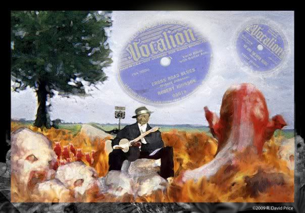
This weeks Illustration Friday topic is music. I've been listening to lots of blues lately and decided to experiment with some new brushes in Photoshop. So I created this digital painting with Photoshop CS4. This is an image of the birth of the career of Blues Legend, Robert Johnson who has legend has it, wanted to learn to play the blues and went down to the Crossroads and made a deal with the devil by selling his soul to learn to play the blues. This is my interpretation of what happened out on Highway 61 deep in the heart of the Mississsippi Delta region.


<

Saturday, November 21, 2009

Does The Use of Clip Art Hurt the Professional Illustrator?

I see this topic around the internet and the general question is: Desktop publishing and the use of Clip Art has everyone people the ability to add graphic images to documents. Does this spread of clip art pose a threat to the professional illustrator?


When I initially read this question, I had to stop and think. The thing that gave me pause was all of the issues that are similar to this and seemed to have bundled themselves together in my mind. I'll explain. I've been involved with custom illustration work since the late '70s. In those early days of my freelance career I would get all kinds of odd jobs because I would take anything that came my way for the experience. We had no form of mass communication with other artist the way we do today. Most of the research you could do on an illustration career was found in out-of-date books in the local library and they were few and far between. So everything you learned, someone taught you that had experience or you jumped into the project and learned as you went.

The goal of course was to go to college and learn all the mysterious secrets of success. Forget forums online where you can ask other people that we have today. In those days you may have been lucky enough to know the cousin of some guy who was married to the woman who cut and pasted newspaper ads for the local weekly newspaper. Or perhaps you had an art teacher in high school who once did the cover of a local literary magazine? Or the lady next door painted barns and teacups on doilies. This was your point of reference for information.

So let me back-up a bit. That lady who worked at the newspaper doing paste-up is our link to this answer. I didn't know her. But I knew people like her, people who had to compose ads for the newspaper. In my case I knew the store manager of the local Wal-mart and each store back then made their own newspaper ads. I think at this point there were only about 200 Wal-mart stores in the world. And they did everything to cut costs back then. Even using local store employees to make the paste up ads for their local newspapers.

My friend saw that I was interested in advertising art (graphic design was not a common term then, people tended to refer to it as commercial art back then). So he let me start preparing the ads for weekly sales. And you know what? We used clip art.

Every store had sign painting kits to make their in-store signs for windows and displays. No on-staff artist, just the most talented person who would step up and volunteer generally got the same minimum wage to be creative rather than unload trucks and clean bathrooms.
Now being creative is a very subjective term thinking back on what we did then. But in addition to those sign kits each store had ad kits too.
The local newspaper staff person would come by and pick up the work when it was ready and you would get the work ready by using these kits.
They were primarily composed of stock images of clip art. Drawings of models in various generic looking clothes, Toasters, mixers, and
other appliances. TV's, stereos, bags of cookies, chips,clothing, etc. There was generic clip art for all of it. All you had to do was get the information for the proposed sale and find your art. Clip it, paste in a tasteful layout and pass it off to the folks from the newspaper advertising department. We would even save all of the proofs for our old ads and sometimes cut them up to reuse certain pieces of clip art, as I mentioned we had to keep cost down.

Were we putting illustrators out of work? Absolutely not. Were we being asked to come up with some unique visual creation? Heck no!

I eventually headed off to that fabled institution called art school. Back then my school of choice was Oklahoma State University School of Technical Training at Okmulgee. Then reputed to have
the fourth best commercial art program in the country. And just a mere few hours from my home. My eyes were opened to the world of custom illustrations and ads. One of the things we were taught was to maintain a 'swipe' file. A file of clippings and photos that you could use
in your work to expedite your work flow. Having handy reference could save you time and money.

The legend of one student there was that he was so over-zealous with his file system that he quickly ran out of space. He supposedly had a little train of three filing cabinets on wheels he would drag to class every day just so he could be the best designer in the school.

One thing we never did was discuss clip art. In fact I don't think my work on the newspaper ads even came up. Nor the methods employed in the teaching curriculum.
We were to busy learning how to use the art-o-graph, the hot wax machine, slicing rubylith and amberlith, ordering type, inking with triangles and T-sqaures, etc. When we toured some ad agencies in Tulsa we even saw real living and breathing on-the-payroll staff illustrators. (Though they were never employed in the same ratio as the graphic designers and paste-up artist at the time.)

Now the big days of illustration were already over. Photography had already come into its on and replaced illustration as the image type of choice in most cases. So even though those clip art books existed they were not harming the illustrator anywhere nearly as much as the photographer was.

As I have already talked a lot about this subject without getting an answer to the question, I will jump forward in time and save you decades of anecdotes.

In the mid -'90s I had worked with clip art, custom illustrations, cartoons, typography and photography to create designs. Both for print and for this new budding technology, the web. In fact most people thought I was crazy for wasting so much time on the internet. But one of the
things I discovered was all of the great free fonts and clip art you could get. Heck The Corel Corp. would give you a whole catalog full of the stuff if you bought their software, the Corel Draw Suite. Even Adobe and Macromedia would even throw some clip art and free fonts in the mix as an incentive to purchase their software too.

As I worked with computers over the coming years, I found that clip art was a great tool to knock out a low budget, quick turn-around type job. An ad for a family reunion. A flyer for that lady who painted barns and now decided she would offer the world art lessons. A newspaper ad for a furniture store, a business card for the small business owner or a church bulletin for a local church. None of these type of work had budgets alocated for custom work. But the work needed doing. The fact that clip art existed made these jobs possible. It put no one out of work and generated a tiny bit of cash for the original creator of the clip art when they sold it to the clip art publisher. (These where ually images owned by the artist that had already been generated for other custom work and now was being resold for use again so that some residual income could be generated from work that had already been paid for.)

Today, I own a 'swipe file' full of clip art. I also have several of those big clip art collections you see advertised. And you know what? They are
great for what they are....time savers. They allow you to take on some of those low paying jobs to keep the electricity turned on. If you are very creative you can do a mash-up of clips and create original work. But if your client isn't paying you to do this your are just killing time that could be spent on other work in your studio.

Now when doing design work I don't buy stock illustration. I consider the term 'stock illustration' to be that type of work that is a step above the massive clip art collections. The work cost more to acquire the useage rights to. It is also used less than the general copyright free clips are, so it is less visible in the public eye and thus has a perceived higher value. While some stock illustration and photography are similar to the clip art we discussed earlier in the fact
that they may be images an artist already had created and just had sitting in inventory waiting to be re-used. Some stock art is actually generated for the purpose of selling it as stock imagery. Especially in the photography field. Yes photographers are still competing with illustrators for sales of visual art today.

So here we are today in a world filled with clip art, stock art and custom art. The difference in the times is that while clip art and custom art both existed back then, stock art has risen to the top in playing a larger role in image use. Not only for convenience and keeping budgets
lean, but also because we are not in a world of local creators. We are in a global world of image makers all connected to the public and vying for attention via the world wide web. We don't just rely on pounding the pavement to get face time with art directors, nor sending them
postcards every quarter reminding them of our existence. We don't have to spend thousands of dollars just to get printed in an illustration directory next to all of our competitors just to be seen. Now we too can connect with image buyers in a quicker and more efficient means by the use of technology and improved communications that are now available to the design studio owners.

The thing we have to do as illustrators (as opposed to designers) is market the fact that we create unique imagery that is not seen by everyone else in the world prior to its usage as new work. You don't have to worry about the competitor down the street having the same weekly flyer images as you do which would make you seem un-original printed with your shared stock imagery. (Though if you are working with a large corporation who expects custom work, you sure better not try to cut corners and deliver a job with stock imagery as it will come back to haunt you.) Market yourself as creating original and unique work for the task at hand and play up all aspects of this unique originality.

But....don't beat yourself up trying to convince a cheapskate to pay more for custom work. Some people are committed to being cheap and tasteless(They probably are not educated in the arts enough to realize they have no taste). It is not your mission in life to change or educate them. That is just a deep hole to throw time and money into that will have little or no return. If they want work created with clip art or stock art let them have it. They are not going to pay an illustrator working wages anyway so the usage is not cutting into any illustrator's work load. These people are who stock and clip art were designed to reach. In a way it is a 'headache
relief'' tool as it helps take care of them while leaving you more time to work on real illustrations for people who see the value in custom work and are willing to pay a realistic fee for its creation.

So in retrospect, photography killed the spread of illustration and cartooning. Clip art and stock art are just side effects of artist trying to generate additional income while reselling art that they already own the rights too. And while print editors and art directors have made the choices over the decades to embrace the spread of photography. The rise of electronic publishing has seen such a huge growth in recent years so that stock images and clip art have been gobbled up and regurgitated enough to where the images are becoming common. Or the quality and sameness when compared to custom work is very apparent to even the less trained eye.

Custom illustration once more is needed and is a commodity that is in short order compared to days gone by when illustration was king. Originality is the key to selling the idea of custom work.
Finally I can't touch on this subject without bringing up one other thought that gets bundled together with this topic in my mind. It is the topic that is the core of what makes me have a bad feeling about custom illustration and dealing with cheapskates. That topic is 'Spec Work'.
Spec work (short for speculative work) is work that is done for no financial compensation. It is done for the promise of exposure or to get your foot in the door. It may be pitched as a sample or just trying you out to decide between you and the other one or two hot-shot artist the
potential employer is considering using. Spec work is the work that those cheap and sometimes con-artist clients are trying to foist on the new designer or the inexperienced illustrator. The get-something-for-nothing crowd. Students beware! It is dangerous and a waste of your time.

Nothing ever good comes from it to the artist. It is the classic instance of someone being taken advantage of. It is like the star struck actor arriving in Hollywood looking for any entrance into the industry. You will be an instant target and labeled a sucker. You will cheapen your work and
reputation and all of the other folks working in illustration as well. Spec is bad! Spec should be fought and taught against at every opportunity.
No matter what they say or how they make you feel, do not be lured into this scam. These are people who do not value you, they do not value your work or education. They are out to lie, cheat and steal any way they can to save a buck. They are not concerned with real quality and
originality. These are people I do not work with and will not work with. If you are wise, you won't either.

So sometimes there is a feeling that clip art is like spec work in that it can harm the industry but when we really look at the issue, clip art and stock art are not the villains, 'spec' work is! Join the 'No Spec' campaign today. (Visit nospec.org)Keep in mind the Graphic Artist Guilds' "Ask First" campaign. Stand up for your artistic rights as well as your fellow artist. Help educate one another as well as new students entering the industry. Because if you hide in a corner and let this type of thing get out of control you will find yourself not getting paid what you are worth. Nor will anyone be left to value custom work. Avoid the meat markets like elance.com. These are not gigs worthy of your time, their clients are buying work that is the bid for the cheapest deal type
jobs. You can't compete with someone in a third world country who will work for pennies on the dollar. And these third world artist can't compete on a creative playing field that is present for true custom illustrations. That being said you don't work for anyone willing to take advantage of another human being that way. You also can't expect that the work generated there will be the best work available as artist will not put as much into a ten dollar job as they will a thousand dollar job. You get what you pay for. That is why these companies are bottom feeders and not part of the large corporate world. Microsoft and Apple don't start a new campaign and run to elance.com looking for original creative work because it is cheaper there and can save them money on their budget. No, instead they buy the best art available that is custom fit to their unique campaigns. They pay for the best people because they want the best work to represent their image to the world. In doing so they create a personae that helps the public perception of their corporate image and sells products as well as shares of stock.
Meanwhile Joe's T-shirt shop is feeling lucky because they got some guy to design a new shirt for free, all they had to do was point out that at least 25 people would see his work and the exposure would be overwhelmingly beneficial to his future career. Remember No Spec!

Well I guess you get the idea by now. I see clip art and stock as useful tools. I don't personally sell my images in this manner. I do however use the material when originality is not the key factor and budget and deadline considerations are. On the other hand spec work kills our
industry and the value of our work. That is the real area of concern to the illustrator in a troubled economy.

Wednesday, November 18, 2009

Color Use in My Work

This is a recent question I received about color.

"You have used color extensively in your own work will you share some of your personal preferences?"

The ways to add color are many and varied. Some of these methods are able to work together effectively and some are not, primarily due to the nature of the mediums in question. For example you can not add watercolors on top of dried tempera paints as the moisture would disturb the underlying medium of tempera.

I've always been adventurous with art tools and love to find new ways of approaching image making. My color favorites include, watercolors, Conte' pencils, acrylics, colored pencils and with computers-digitally. Other methods I have used in the past and still do when needed are, oils, pastels, gouache,tempera, casein, alkyds, markers, crayons, watercolor tins, watercolor pencils, enamels, colored inks and colored dyes, fingerpaints, airbrushing, spraypaint and colored ball point pens.

I've been attracted to colors since I was a kid growing up in the 1960s. Plastics were able to accept vivid highly saturated colors at this point-in-time and toys came in many vivid hues. When I was about 5 years old we bought a large color TV, going from black and white to color
was huge in impacting my young mind. At first I thought everything that was filmed in black and white was from the past and apparently before color had been invented.(In fact the film that I made sure to watch annually, "The Wizard of OZ" was filmed in color decades earlier, unbeknown to me at that time.) I later realized that was a wrong assumption but found it funny when my kids came to a similar analysis
when they encountered black and white films for the first time at a young age.

Needless to say Saturday morning cartoons and all the great 60s TV shows that started filming in Technicolor over the course of the decade(as opposed to the cheaper black and white) literally blew my young mind. The NBC peacock was truly spectacular and worthy of watching
each time it appeared as far as I was concerned. Or the CBS chimes that followed the brightly colored letters with the voice over stating,"Filmed in Living Color" (not to be confused with a FOX TV series by the same name that followed decades later).


Shows like Hogan's Heroes, Bewitched, Gunsmoke, and the Beverly Hillbillies went from one season in black and white to the next in color and it seemed like they had leaped into the future. Meanwhile shows like the '60s Batman and Green Hornet played up primary colors found
in use in comics and that was my other huge are a of influence, comic books and comic stips. The dynamic use of primary colors in comics. I loved the black and white line work when I could see it printed by itself but the color comics really brought life to the medium. One reason why Sunday Funnies are always bigger draws than the smaller black and white dailies in the comic strip sections of our newspapers, is that spark of life the color adds.

Finally my teachers in elementary school exposed me to fine art at the capitol building in Little Rock, Arkansas on field trips. There I encountered my first color field paintings along with other abstracts that just focused on color.
Ever since then I have loved using color, weather it be full color or something as simple as a monochromatic scene.